Mobile SEO: How to Rank Higher on Google and AI Search

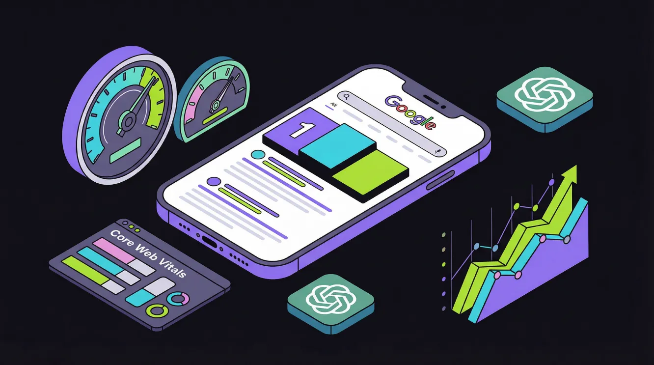
Over 62% of all global web traffic comes from mobile devices, and Google has been ranking websites based on their mobile version since mobile-first indexing became the default for all sites. If your site performs poorly on a smartphone, it performs poorly in search results - regardless of how strong your content or backlink profile might be. Mobile SEO covers every technical, content and user experience decision that determines whether your site ranks, loads fast and gets cited by AI platforms like ChatGPT, Perplexity and Google AI Overviews. Getting it right is not just about ticking a mobile-friendly box - it is about building the technical foundation that drives real search visibility and measurable revenue.
Quick Guide: What Is Mobile SEO?
Mobile SEO is the process of optimising your website so it ranks, loads and functions properly on mobile devices. Mobile devices account for 62.73% of global web traffic, and Google's mobile-first indexing means your mobile site is the primary version Google uses for ranking and indexing. A well-optimised mobile site directly improves your visibility in traditional search results and increases your chances of being cited by AI search platforms, including ChatGPT, Perplexity and Google AI Overviews.
Fix the Mobile Technical Issues Holding Back Your Rankings
The mobile SEO principles in this guide depend on a solid technical foundation underneath them. Rankmax's technical SEO consulting service diagnoses and fixes the structural problems - slow page speeds, content parity gaps, broken schema and crawl errors - that prevent your site from ranking on Google and getting picked up by AI platforms.
Explore Technical SEO ConsultingWhy Mobile SEO Matters More Than Ever
Mobile SEO has moved from being a nice-to-have to the technical standard for every site that wants search visibility. The data behind this shift is stark, and the consequences of ignoring it are significant.
The Scale of Mobile Search
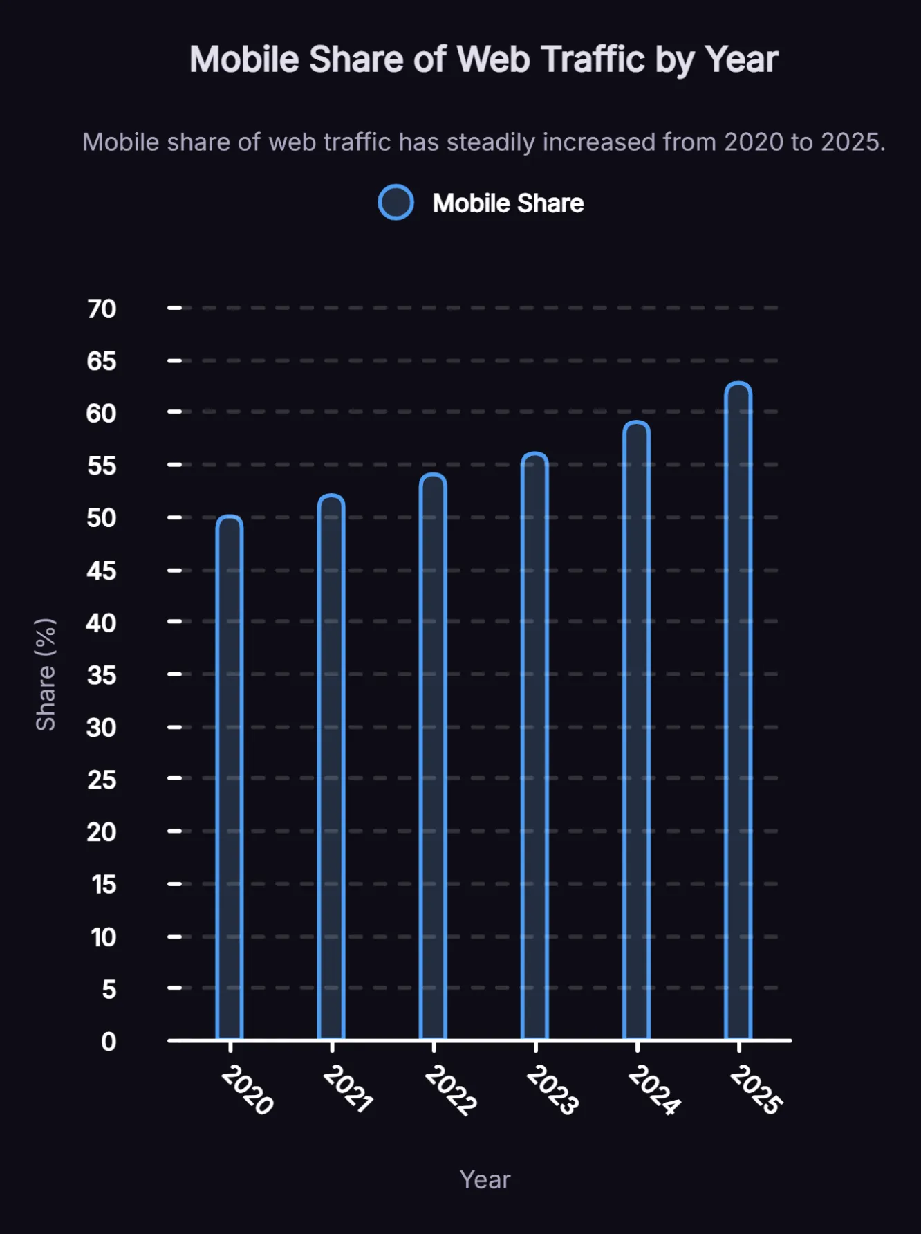
Mobile devices now drive over 62% of all web traffic globally, and that figure has been above 50% since 2020. Google holds 95.17% of the global mobile search market, meaning almost every mobile search query goes through Google's ranking systems, which prioritise mobile performance over desktop. For businesses targeting organic search, there is no longer a meaningful separation between mobile strategy and SEO strategy. They are the same thing.
Only 11% of Pages Rank the Same on Desktop and Mobile
Research shows that only 11% of pages rank in the same position on both desktop and mobile. That gap exists because mobile performance signals vary significantly from desktop, including:
- Page speed
- Core Web Vitals scores
- Content parity
- Usability
Many businesses have invested in strong desktop experiences while leaving their mobile performance largely unaddressed, and their rankings reflect that gap. Closing it is where the biggest ranking opportunities often sit.
What Mobile-First Indexing Actually Means for Your Site
Google announced in October 2023 that the move to mobile-first indexing was complete, so Google now primarily uses the mobile version of content for indexing and ranking. Understanding what it actually requires is the starting point for any serious mobile SEO effort.
Mobile-first indexing means Google uses the mobile version of your website as the primary basis for indexing and ranking, rather than the desktop version. Your desktop content, metadata, structured data and internal links all become secondary. The consequence is direct: if your mobile site is missing content that exists on desktop, Google will not rank you for it. If your mobile site loads slowly, your overall rankings suffer - including for desktop users.
Content Parity - The Most Common Mobile SEO Mistake
Differences between mobile and desktop content can create indexing problems, because Google primarily uses the mobile version of a page for crawling and evaluation. If important content is missing on mobile, it may not be fully understood or indexed. Common content parity issues include:
- Body copy or product descriptions that are shortened or hidden on mobile
- Navigation items that disappear on smaller screens
- Internal links present on desktop but absent from mobile layouts
- H1-H6 heading structures that change between devices
The fix is to audit your site using a mobile crawler and compare key pages side-by-side between devices. Every piece of content that contributes to your rankings needs to be present and accessible on mobile. This single audit action often unlocks immediate ranking improvements.
Structured Data Consistency Across Devices
Structured data markup needs to match between your mobile and desktop versions. Mobile pages often lack the schema markup present on desktop versions, which reduces your eligibility for rich snippets in mobile search results. Since rich results are especially effective on mobile devices where screen space is limited, having schema present and consistent on mobile directly improves click-through rates.
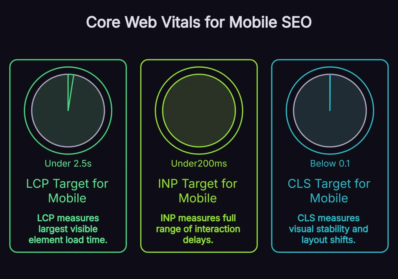
Core Web Vitals: Performance Benchmarks That Support Page Experience and Search Visibility
Core Web Vitals are Google’s key performance metrics for measuring page experience. They are used by Google’s ranking systems, which means poor mobile performance can weaken search visibility, especially when it creates a worse experience for users. However, strong Core Web Vitals scores alone do not guarantee higher rankings, as content quality and relevance still play a larger role. There are three metrics to focus on.
1. Largest Contentful Paint (LCP)
LCP measures how long it takes for the largest visible element on a page - typically a hero image or headline - to load. For good mobile SEO performance, your LCP should be under 2.5 seconds. Pages that exceed this threshold tend to have higher bounce rates and lower rankings. The most common causes of slow LCP on mobile include:
- Uncompressed images
- Render-blocking JavaScript
- Slow server response times
To improve LCP:
- Convert images to WebP format
- Implement lazy loading for off-screen content
- Enable browser caching
- Use a Content Delivery Network (CDN) to reduce latency
Compressing images can reduce file size without significantly affecting visual quality, making image optimisation one of the highest-impact actions for mobile page speed.
2. Interaction to Next Paint (INP)
INP replaced First Input Delay (FID) in 2024 and measures the full range of interaction delays throughout a user's session - not just the first tap. INP should be under 200 milliseconds for a good mobile experience. High INP scores are typically caused by:
- Excessive JavaScript execution
- Large DOM trees
- Third-party scripts that compete for processing power on mobile hardware
Auditing and trimming your third-party scripts is usually the fastest way to improve INP.
3. Cumulative Layout Shift (CLS)
CLS measures visual stability - how much page content unexpectedly shifts as it loads. A CLS score below 0.1 is the target for a good user experience. On mobile, layout shifts are especially disruptive because they cause users to tap the wrong element. The most common causes are:
- Images without defined dimensions
- Dynamically injected content
- Font swaps
Setting explicit width and height attributes on all images and avoiding inserting content above existing page elements will bring most CLS issues under control.
Responsive Design: The Right Way to Build for Mobile
Responsive design is Google's recommended approach to mobile SEO because it uses a single URL and codebase that adapts to different screen sizes. This approach is simpler to manage and avoids the content duplication and crawl budget issues associated with maintaining separate mobile and desktop sites.
What Responsive Design Actually Requires
A responsive site is not just one that scales down to fit a smaller screen. It needs to deliver a genuinely usable experience on a phone. This means:
- Using CSS media queries to adjust layout at different breakpoints
- Setting a fluid grid system that scales elements proportionally rather than using fixed pixel widths
- Optimising typography with readable font sizes and sufficient line height
- Ensuring all important content - navigation, product details, contact information, internal links and structured data - is accessible on mobile without horizontal scrolling
Avoid removing primary content from the mobile HTML or loading it only after user interaction. Using accordions or tabs to save space is fine as long as the content remains present and equivalent on mobile. Google also penalises intrusive interstitials and pop-ups that block content on mobile, so review your overlay strategy as part of your mobile audit.
Touch-Friendly Navigation and Button Sizing
Mobile users interact through touchscreens, and the user experience consequences of poorly sized tap targets are significant. Enlarging clickable elements, menus, CTAs and navigation links helps prevent accidental taps and improves usability on smaller screens, especially on pages with dense navigation or conversion elements. Buttons should have a minimum tap target size of 48x48 pixels with sufficient spacing between adjacent links. Google Search Console will alert you if clickable elements are too close together. Resolve these as a priority.
Mobile Page Speed: How to Hit Google's Benchmarks
Page speed and Core Web Vitals overlap significantly, but there are specific steps beyond image optimisation that make a material difference to mobile load times.
Image Optimisation for Mobile
Images are the single largest contributor to slow mobile page loads. Beyond converting to WebP, use the srcset attribute to serve appropriately sized images based on the device's screen resolution. A 2,000-pixel-wide desktop image served to a mobile device adds unnecessary file weight and slows load time. Lazy loading improves load time by deferring off-screen images until they are needed.
Code and Server Performance
Third-party scripts add significant JavaScript payload to mobile pages, including:
- Chat widgets
- Analytics tags
- Retargeting pixels
- Social media embeds
Each script adds to the processing burden on mobile hardware, which has less CPU capacity than a desktop. Audit your tag manager and remove unnecessary third-party scripts. Aim to keep your DOM size under 1,400 nodes for better mobile rendering stability.
Server response time directly affects Time to First Byte (TTFB), which influences LCP. Use a CDN to serve assets from locations closer to users, enable GZIP or Brotli compression on your server and optimise your database queries if your site is dynamically generated.
Google has reported that a one-second delay in mobile load time can impact mobile conversions by up to 20%, while ecommerce sites loading in one second converted 2.5 times better than sites loading in five seconds. Speed is not just a technical SEO factor. It can have a direct impact on revenue.
That is why we tie mobile performance improvements to measurable business outcomes, not treat them as isolated technical fixes. In our eCommerce SEO case study, technical SEO improvements, including image compression and mobile responsiveness fixes, supported an 8-month growth campaign. This increased monthly organic revenue from $77,000 to $147,000 and delivered $968,000 in cumulative revenue.
Mobile SEO and AI Search: Getting Cited by ChatGPT, Perplexity and AI Overviews
Mobile optimisation extends beyond Google rankings. AI search platforms, including ChatGPT, Perplexity and Google AI Overviews, are now significant traffic and citation sources, and they reward technically sound, mobile-optimised content. Understanding how AI search works is important context for any serious mobile SEO strategy.
How Mobile Technical Health Supports AI Search Discoverability
Fast, mobile-optimised pages are easier for both users and search systems to access, render and understand. That matters because Google says the same foundational SEO best practices still apply to AI Overviews and AI Mode, with no separate technical requirements beyond:
- Strong crawlability
- Accessible content
- Solid site quality
OpenAI also describes ChatGPT search as using web search with links to relevant sources, while Perplexity describes its search as ranked results from a continuously refreshed index rather than a published list of mobile-specific citation factors.
A technically healthy mobile site does more than support traditional SEO. It also makes your content easier to discover, access and interpret across AI-assisted search experiences. Pages are easier for search systems to process when they:
- Load cleanly
- Expose their main content in HTML
- Avoid unnecessary rendering barriers
They perform better than pages with slow performance, fragile JavaScript execution, or key information hidden behind interactions. Our AI SEO approach treats mobile technical performance as a core part of search visibility, including AI search, rather than a separate discipline.
Structured Data and Schema for AI Visibility
Structured data can help search engines understand the meaning, type and context of a page when it matches the visible content. It can support eligibility for certain search features and improve content clarity. However, it should not be described as a core requirement for AI visibility or tied to a published weighting for Perplexity, as neither Google nor Perplexity publicly documents ranking formulas at that level of detail.
For mobile SEO, focus on structured data that accurately reflects the page and is consistent across devices:
- Use the FAQ schema only where it is genuinely appropriate and aligned with the current Google eligibility guidelines
- Use Article schema to clarify authorship, publication date, and last updated information on blog and resource pages
- Use the LocalBusiness schema with accurate address, phone number, and opening hours for location-based searches
- Ensure structured data is consistent across mobile and desktop versions, where separate URLs or rendering differences still exist
Clear formatting, strong information hierarchy and extractable on-page answers can also make content easier for search systems to interpret. Passage optimisation, formatting content so key sections are easy to extract and understand, can work alongside structured data to support visibility across AI-assisted and traditional search experiences. A better way to frame this is that schema and passage-level clarity support discoverability and understanding, not that they guarantee inclusion in AI Overviews or ChatGPT responses.
Local SEO on Mobile: Capturing Purchase Intent When It Matters
Local SEO and mobile SEO are deeply connected because the majority of local searches happen on mobile devices. Understanding this relationship matters for any business with a physical presence or a defined service area.
Near Me Searches and Location-Based Intent
76% of people who perform a local search on their smartphone visit a related business within 24 hours, and 28% of local mobile searches result in a purchase. Mobile searches carry stronger purchase intent than desktop searches, particularly for location-based queries. Around 30% of all mobile searches are related to location, and "near me" queries have grown over 200% in recent years.
For businesses targeting local mobile traffic, mobile SEO and local SEO need to work together. This means:
- Ensuring your Google Business Profile is complete and accurate
- Embedding location data and Local Business schema on your contact and service area pages
- Making phone numbers and addresses tap-to-call and tap-to-navigate on mobile
- Loading local landing pages quickly on mobile devices, since slow local pages lose high-intent searchers immediately
Common Mobile SEO Mistakes That Cost Rankings
Most mobile SEO problems fall into a small number of categories. Identifying and fixing them is the most direct path to improved rankings.
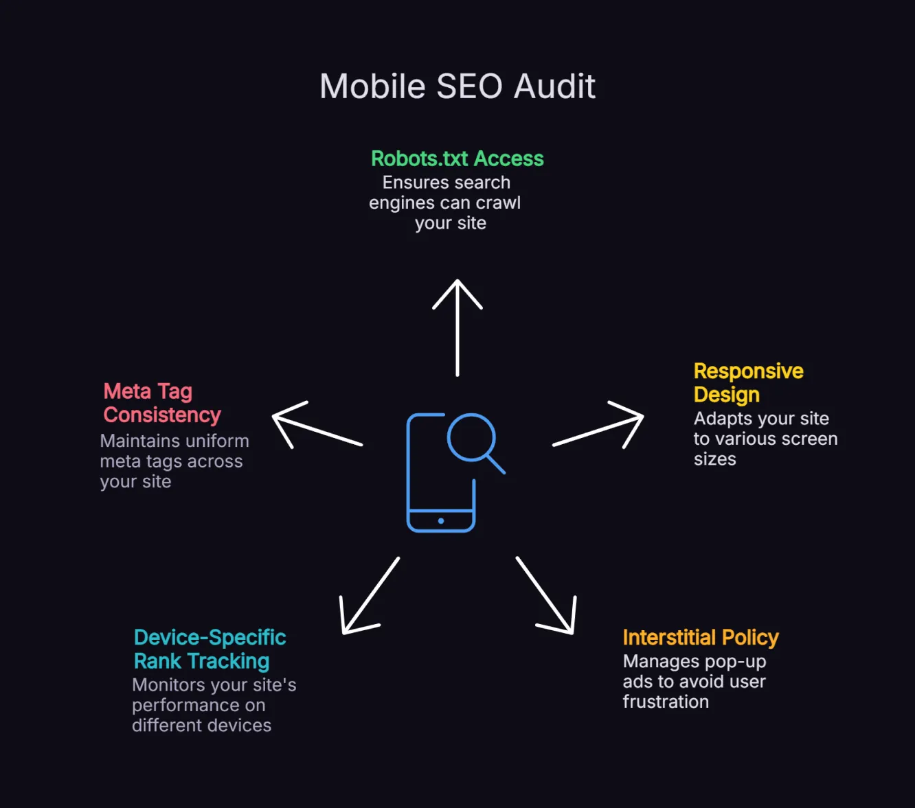
1. Blocking JavaScript or CSS in robots.txt
If Googlebot cannot access the scripts that render your mobile layout, it cannot accurately assess your mobile user experience. Ensure your robots.txt file allows Googlebot to crawl all JavaScript, CSS and image files.
2. Different URLs for Mobile and Desktop
Separate mobile sites (m. subdomains) create duplicate content issues, canonical tag complexity and crawl budget inefficiency. If you are running an m. subdomain, a migration to responsive design will almost always improve your mobile SEO performance.
3. Pop-Ups and Interstitials That Cover Content on Mobile
Google's intrusive interstitial penalty applies specifically to mobile, since full-screen overlays on small devices are significantly more disruptive than on desktop. Ensure any email capture or consent overlays do not block the main content.
4. No Separate Monitoring for Mobile Rankings
Only 11% of pages rank the same on desktop and mobile, but many businesses only track overall rankings. Set up device-specific rank tracking to identify mobile-specific visibility gaps and prioritise fixes.
5. Missing or Inconsistent Meta Tags on Mobile
Ensure your mobile pages carry identical meta titles and descriptions to your desktop versions. Inconsistent metadata between devices creates confusion for Google's indexing systems and reduces your eligibility for rich snippets on mobile.
Frequently Asked Questions About Mobile SEO
What is mobile-first indexing and how does it affect my rankings?
Mobile-first indexing means Google uses the mobile version of your website as its primary reference for ranking and indexing, rather than your desktop version. If your mobile site is missing content, structured data or internal links that appear on desktop, Google will not rank you for that content. Businesses that have not audited their mobile and desktop versions for parity may find that their rankings are limited by issues they cannot see on desktop.
How do Core Web Vitals affect mobile SEO?
Core Web Vitals are Google's page experience metrics - Largest Contentful Paint (LCP), Interaction to Next Paint (INP) and Cumulative Layout Shift (CLS) - that directly influence search rankings, especially on mobile. Pages with poor Core Web Vitals scores on mobile are more likely to rank lower than competitors who meet Google's performance thresholds. Monitoring your Core Web Vitals in Google Search Console and PageSpeed Insights on a regular basis is a standard part of ongoing mobile SEO maintenance.
Does mobile page speed affect AI search citations?
Yes. AI platforms including Perplexity and Google AI Overviews, crawl and index web content. Sites with fast mobile load times and clean technical foundations are easier for AI crawlers to access and extract content from. A well-optimised mobile site increases your eligibility for citations across both traditional search and AI-generated answers. This is why Rankmax treats mobile technical performance as a core part of AI SEO strategy, not a separate consideration.
What is the difference between responsive design and a separate mobile site?
Responsive design uses a single URL and codebase that adapts to different screen sizes using CSS. Google recommends this approach because it is easier to manage, avoids content duplication and consolidates link equity to a single URL. Separate mobile sites (m. subdomains) require canonical tag management, create crawl budget challenges and often lead to content parity issues between versions. Unless there are specific business reasons for maintaining separate mobile and desktop sites, responsive design is the right approach.
How do I check my site's mobile performance?
Google Search Console, PageSpeed Insights and Lighthouse are three of the most useful tools for checking mobile SEO performance. Search Console provides real-user Core Web Vitals data and helps surface indexing, crawl and page experience issues through reports like Core Web Vitals and URL Inspection. PageSpeed Insights gives detailed LCP, INP and CLS data alongside practical recommendations, while Lighthouse helps diagnose mobile usability and performance issues such as unreadable text, layout problems and tap targets that are too close together.
Mobile SEO Is the Foundation, Not the Finish Line
Mobile SEO is not a one-time project. It is the technical baseline that supports how your site performs in search, on mobile devices and across AI-assisted search experiences. When that foundation is strong, every content, CRO and SEO investment works harder. When it is weak, growth is harder to sustain. If you want to uncover the technical issues affecting mobile performance and search visibility, explore our technical SEO consultant service. You will get a focused audit, a prioritised action plan and a clearer roadmap for fixing the issues that matter most.
About the Author
Want Insights Like This Fortnightly?

Our AI SEO strategies and tactics delivered fortnightly, including bonus trade secrets not shared anywhere else. No fluff. Just what's working right now. 5-minute read.


